Design tokens
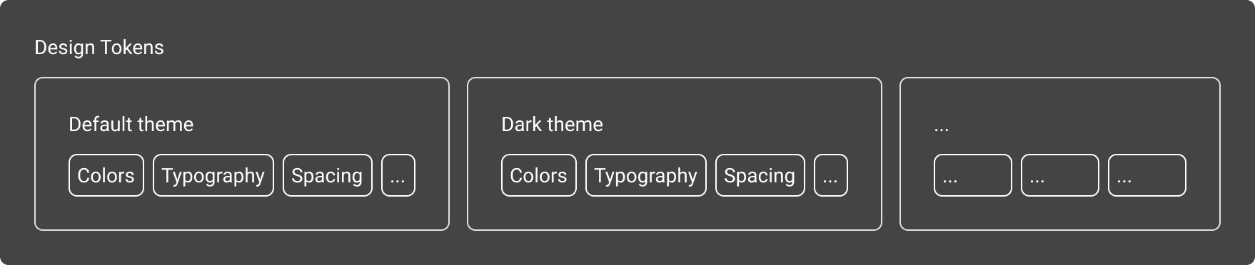
Design tokens are a collection of attributes that describe any fundamental/atomic visual style. Each attribute is a key-value pair. Honeycomb 6.0 stores them as platform-agnostic set of json files that act as the main source of truth not only for generated cross-platform assets but also for Honeycomb itself.
Tokens are grouped in theme folders and separated into individual file configurations by the nature of attributes they describe:
CSS
CSS design tokens provided as CSS custom properties. There is a file for every theme available. You can either include these files directly from our CDN or download them to use locally in your app.
If your app already uses honeycomb CSS styles the tokens are already included.
Please note if you need multiple themes, you need to include multiple files. To find out more about themes and how to use them please check our themes documentation
CDN urls
Content
- Colors
- Vast variety of color variables. See our colors documentation
- Typography
- Things like font sizes, font weights, line height.
- Spacing
- A collection of spacing variables. See our spacing section
- Component specific tokens
- A small number of component specific variables like Input sizes or border colors.
